
Deviation Actions


Description
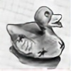
This is the design I created for Christmas cards this year, and for all my online friends who didn't get a real copy, this will have to suffice
(colours added on photoshop, cos I'm lazy like that
Ah, memories! This is a fairly old one now, to the point where I even forgot I’d drawn it. However, there’s still a lot that’s very similar how I think I’d draw the same thing nowadays. The combination of blending, erasing, and loose shading on the feathers, for example, is simple but effective – to a point where I think I can learn from my looser style back then with my tendency to overdo detail nowadays.
The holly leaves seem reasonably well rendered – though I think I might have got a bit carried away with the shine patches. At least I was confident enough to push the tonal variation to darker shades here, as this is something I remember being one of my biggest weaknesses in artwork around or just before this period.
But, of course, there’s always that one cringe point with older work. For this, there’s two major issues. The gaping empty expanses of background, and the strange application of colour.
Colour – well that’s my early exploration into using photoshop. I still hit this barrier, whereby I want my graphite drawings to pop more, and stand out, especially on Christmas cards. But I’ve still not found a nice way of digitally applying that colour while retaining the hand-drawn charm of graphite. And I think it’s safe to say I certainly hadn’t at this point! Really, I needed to do more than just colourise the greyscale layer with flat colours. More variation would have allowed me to make the holly leaves and berries more saturated while retaining the shape the graphite shading gave them initially. Same with the candy cane. Then colouring behind the graphite, the robin would have looked a bit less transparent, and more in keeping with the rest.
As for the background issue, I think that could have been fixed with just a simple square border filling in the blank corners. At least that is one point I think I’ve learnt from and improved upon in the years – most especially from last year’s Inktober, leading into this year’s Critmas artwork!
Still, as far as it goes technically, ignoring the badly applied colouring, I am still pretty happy with this drawing. Maybe in the future I will find more time for other simple illustrations like this one! Though nowadays, I feel I’m more likely to tackle this sort of drawing with pyrography rather than graphite, it’s the skills I learned then that I still carry forward even on other mediums. 